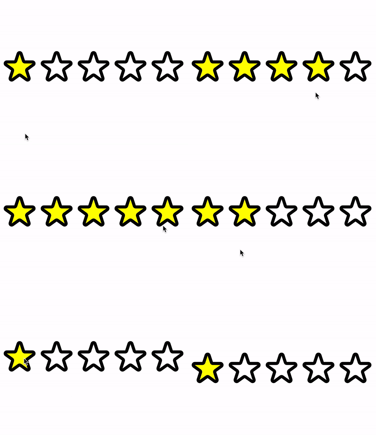
Feedback Stars
Create a feedback rating component that takes in a number of stars and outputs the corresponding star SVGs on the output window. When the user clicks on any of the stars, that stars till that point are highlighted (filled). Once the user hovers over the stars, the stars till that point are highlighted - but not persisted until the user clicks on the star.
Solve Feedback Stars on Algochurn
Practice all the solutions below
Practice the most popular front-end questions asked in coding interviews with Frontend Churn
